Panaya

I led the end-to-end UX research and strategic wireframing for Panaya’s massive digital ecosystem. Moving beyond a simple web presence, the goal was to transform a highly complex architecture into a streamlined, high-converting, and mobile-first web experience. By aligning deep user insights with business objectives, we re-engineered the platform’s navigation, reduced cognitive load, and built a scalable framework designed to capture and convert enterprise-level traffic on any device.
Focus: UX Research, Information Architecture, Advanced Wireframing, Mobile-First Strategy, Enterprise Web Ecosystems.
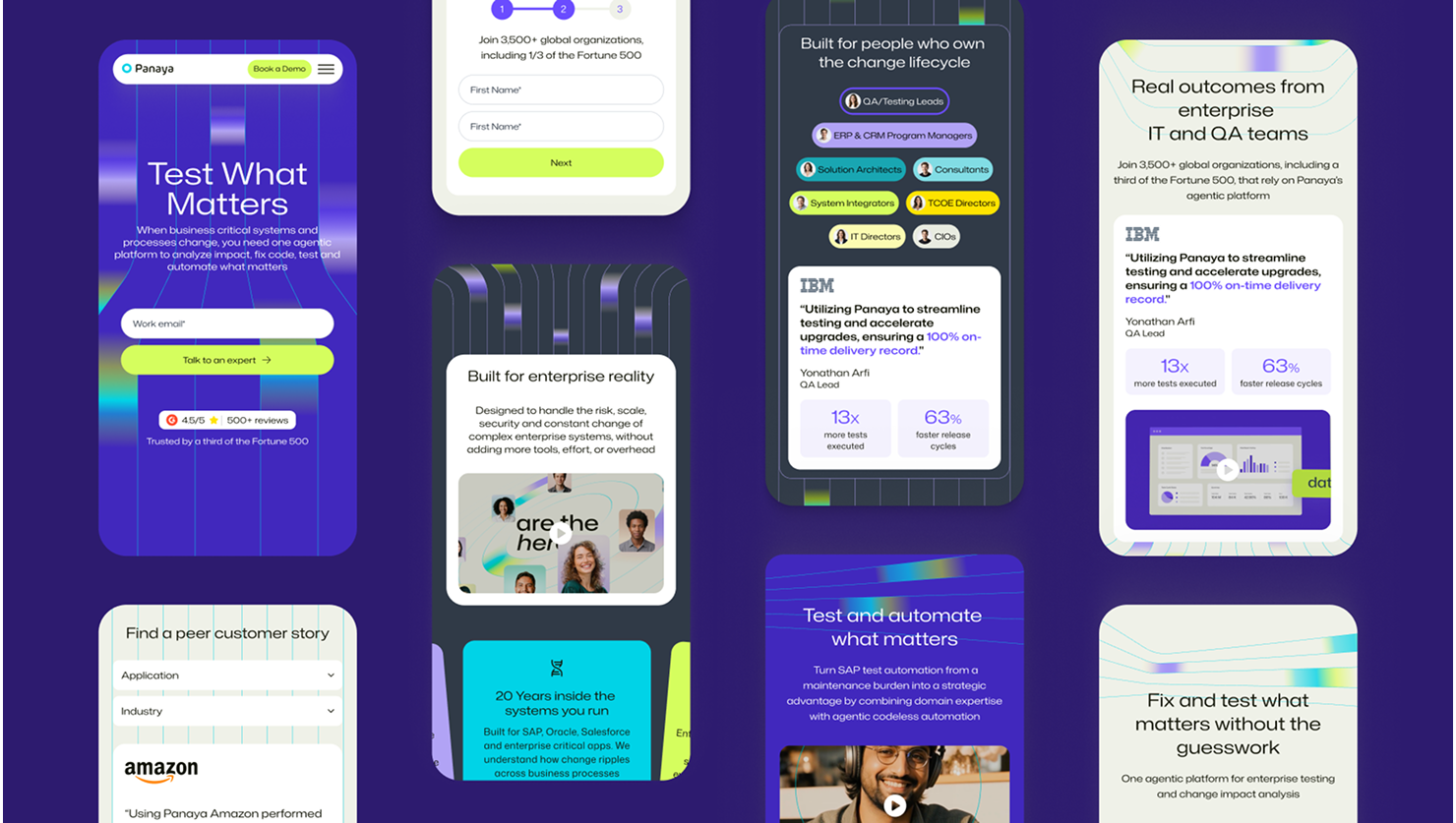
Results : +25% Demo Request | +1M Annual Impressions | -15% Bounce Rate ↓
Goals
1.
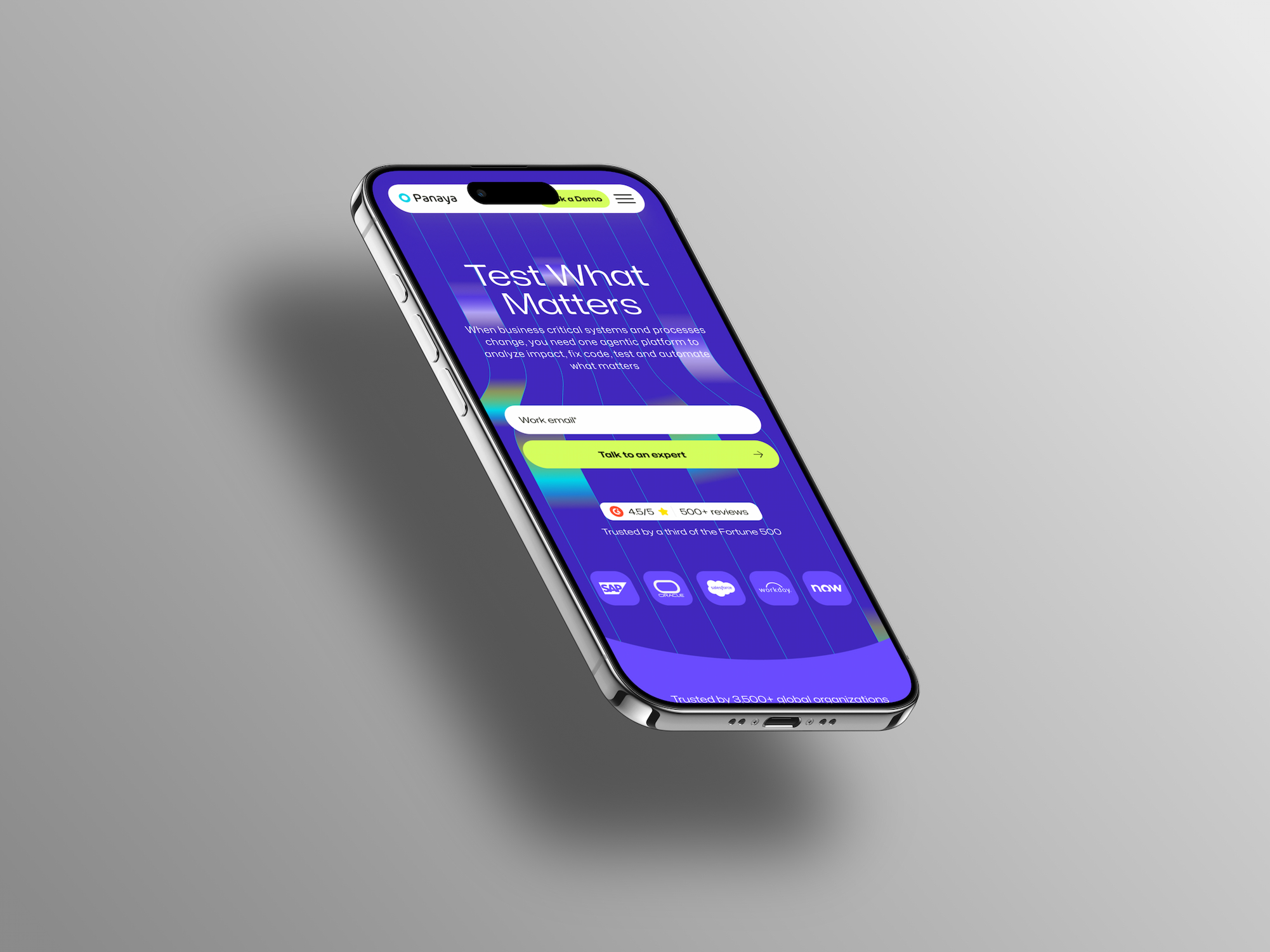
Simplify the shopping journey by creating an intuitive flow that brings a mobile-first, content-driven experience to any device.
3.
Enhance user convenience by optimizing layout frameworks and streamlining the navigation process for a faster, frictionless experience.
2.
Increase trust by highlighting complex features clearly and providing structured, transparent information across the platform.
4.
Drive customer engagement by improving discoverability through progressive disclosure layouts and strategic touchpoints.
Business Goal
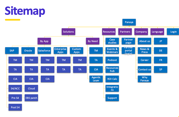
Panaya’s existing web presence was vast, fragmented, and overwhelmed by complex technical data. This heavy information architecture resulted in high drop-off rates and a disjointed browsing experience across devices, limiting overall market reach and lead generation.
Business need: Create a high-performance web platform that simplifies the user journey, structures enterprise-level content logically, and scales the brand’s digital presence seamlessly.
User problem
Enterprise decision-makers looking for specific technical solutions often struggled with dense, desktop-centric layouts on mobile viewports. Complex interfaces made it difficult to quickly compare solutions, evaluate product specifications, or find clear contact pathways.
User need: A dedicated, mobile-first web framework that guarantees instant discoverability, simplifies the digestion of technical product specs, and offers a smooth, reliable exploratory process.
Problem to solve
Panaya’s web platform was vast, complex, and desktop-centric, leading to high drop-off rates and a disjointed user experience on mobile. Enterprise decision-makers struggled to find critical information or compare solutions quickly, which hurt overall user engagement and limited corporate lead generation.
Competitive analysis
Evaluating local and international enterprise platforms allowed us to identify best practices for navigation efficiency, trust-building layouts, and cross-device structural integrity.
1.
Friction
High drop-off rates are directly tied to over-engineered menus and a lack of clear vertical pacing on mobile devices.
2.
Trust
Users hesitate when core values and proof-points are buried underneath generic corporate jargon.
3.
Navigation
Crucial case studies and product segments are often hidden, making it difficult for high-intent visitors to quickly locate specific information.
Friction
Accessible entry points and streamlined navigation paths drastically improve B2B user conversion.
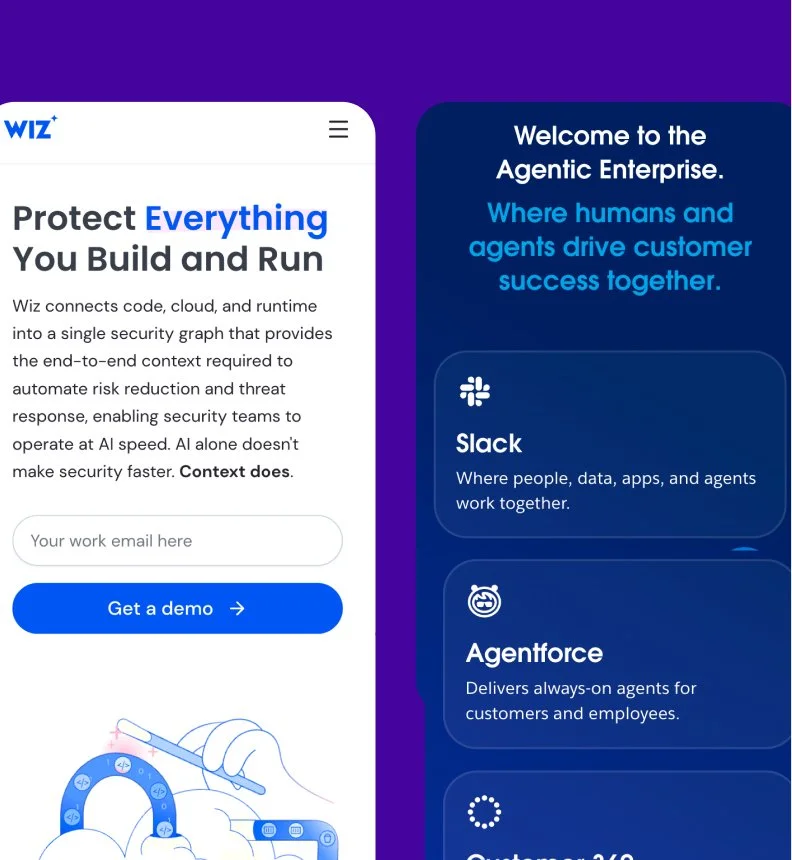
Wiz: Uses a highly focused interface and immediate, interactive product demonstrations to minimize decision fatigue for enterprise technical buyers..
Trust
Clear communication of product compliance, ROI statistics, and technical integrations validates the enterprise buyer's choice.
Salesforce: Provides transparent system documentation and data security guarantees to build immediate corporate confidence.
Navigation
Predictive navigation and intelligent content categorization dramatically reduce the time-to-insight for busy stakeholders.
Wiz: Displays personalized, role-based dashboards that instantly highlight critical data paths for rapid discovery.
Mapping the purchase journey
Guided by research insights, I iterated on design directions to align with user needs and business goals. Principles like transparency, efficiency, and freshness informed every aspect of the Noy Hasade experience. Smart Home Page: A dynamic feed highlighting seasonal picks and personalized recommendations to spark discovery.
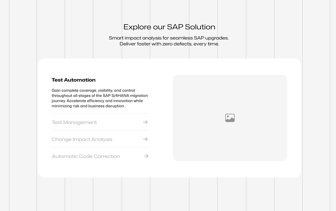
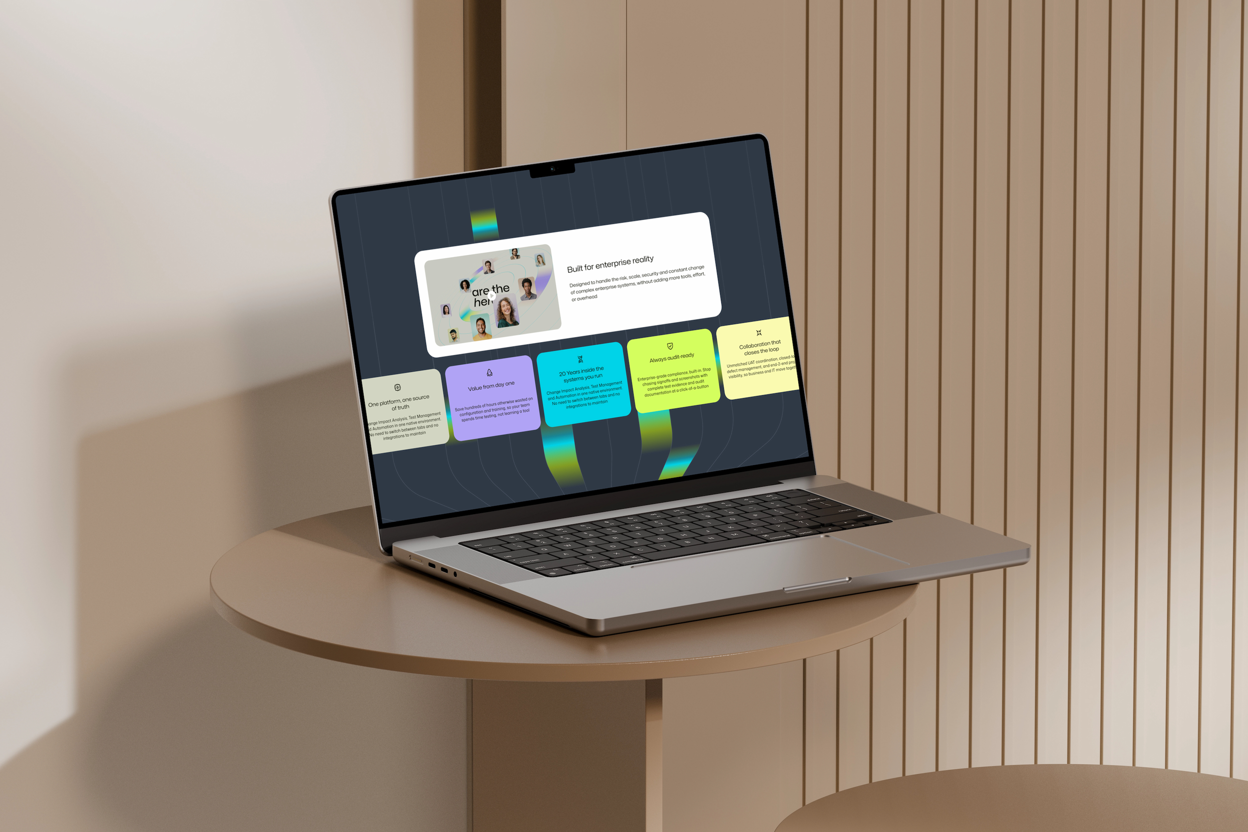
Smart Solution Hub: A dynamic homepage layout highlighting targeted solutions and case studies to streamline discovery for enterprise buyers.
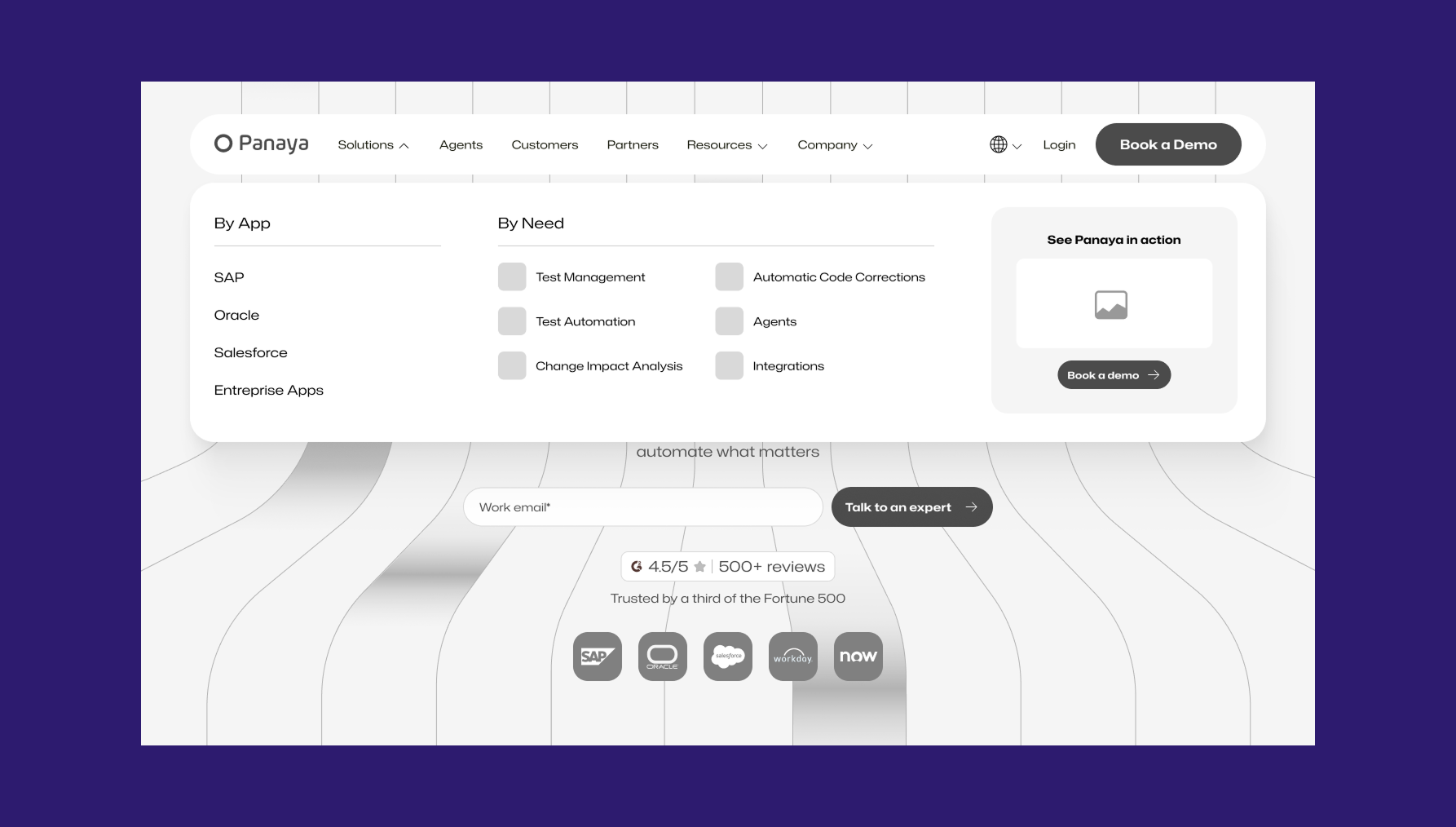
Intuitive Navigation Chips: Centralized sub-solutions and quick-tap filters that allow users to browse complex service lines in just a few clicks.
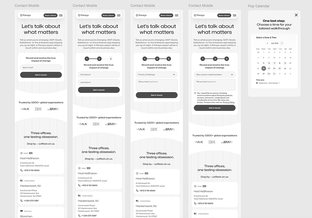
Optimized Conversion Funnel: A high-performing lead generation infrastructure with smart, low-friction forms that maximize business inquiries.
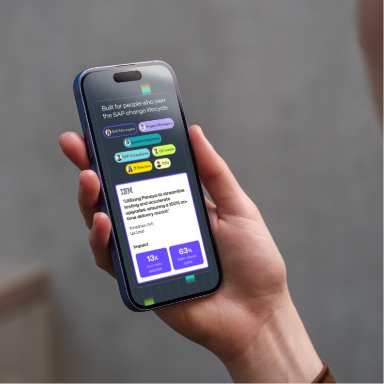
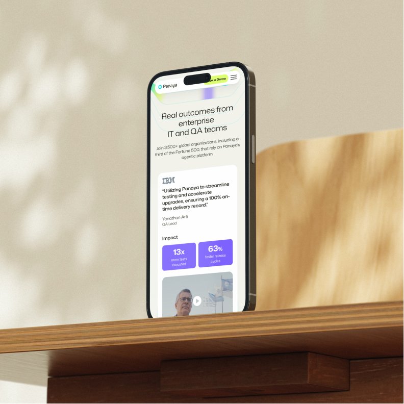
High-Transparency Solution Pages: Clear layouts showing technical specifications, compliance parameters, and ROI indicators to build immediate corporate trust.
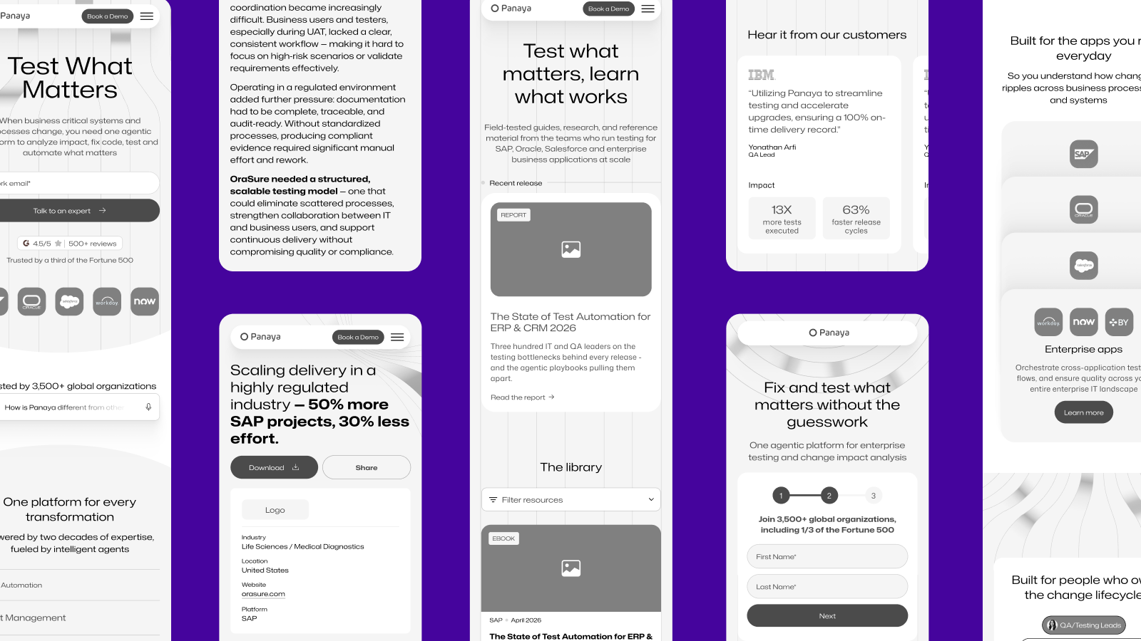
User testing
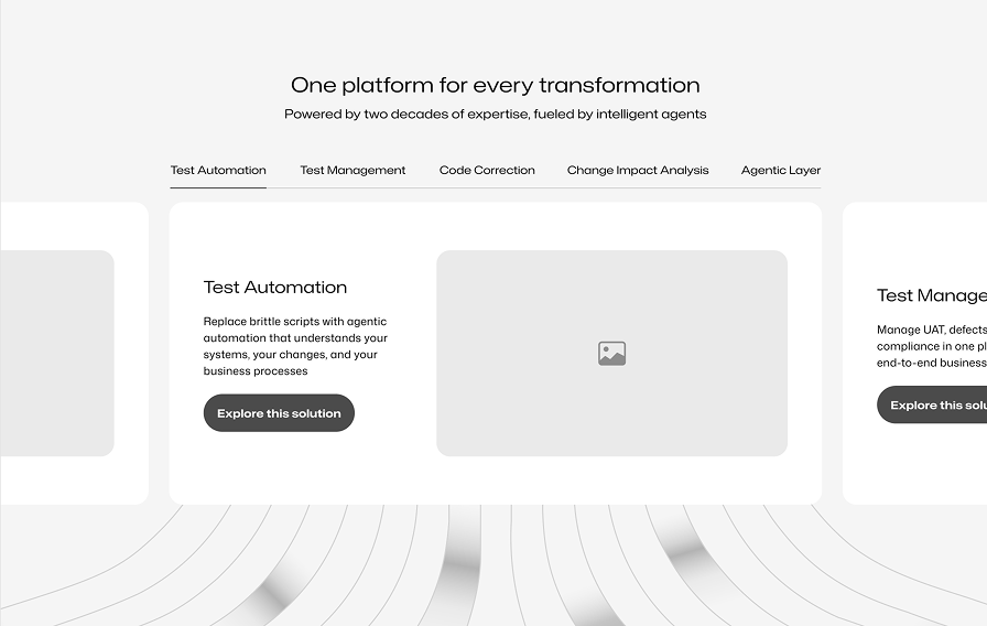
We tested two layouts for the main solution sections to identify which structure best reduced cognitive load and improved product discoverability:
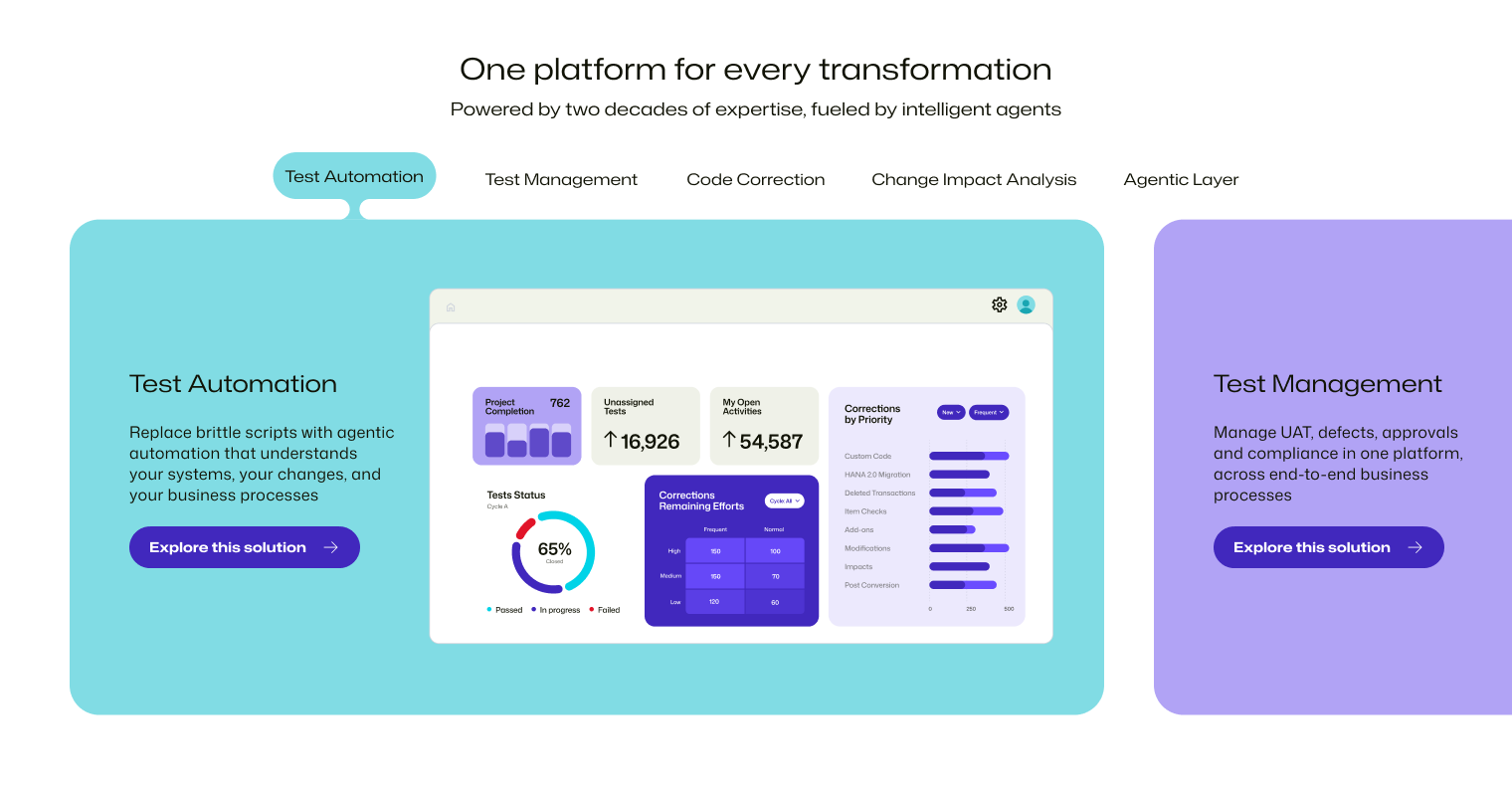
A dynamic, immersive layout featuring a horizontal carousel of large content cards. Users navigate by dragging and dropping (or swiping) to move between transformation categories like Test Automation, Test Management, and Code Correction.
A classic, structured layout where content changes dynamically inside a fixed container based on user selection. It features a vertical list of text links on the left (Test Automation, Test Management, etc.) and a corresponding media/preview window on the right.
A clear preference emerge
We chose the Full Screen Carousel because it perfectly bridges power with user-friendliness. By transforming a static list into a fluid, tactile experience, it allows users to effortlessly swipe through our capabilities rather than forcing them to precisely click small text links. The partially visible edges of the adjacent cards create a natural curiosity that pulls users in, making the discovery of our platform's transformation solutions feel incredibly modern, intuitive, and engaging.
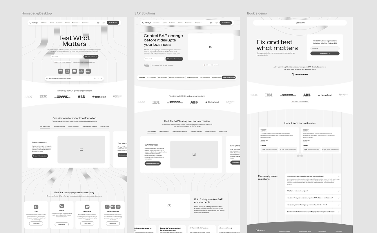
The proposed design
I designed a vibrant, playful interface that brings the energy of a real marketplace straight to the screen. By blending rich brand colors, fun micro-interactions, and sharp visual hierarchy, the app makes it easy to browse seasonal categories, handle variable weights, and breeze through a completely frictionless checkout.
The result
By shifting the entire ecosystem to a mobile-first, navigation-centric framework, the new Panaya UX architecture successfully bridged the gap between dense enterprise data and an effortless user experience. Moving to a highly structured wireframe system allowed the development and product teams to align instantly, dramatically reducing implementation cycles. The redesigned journey successfully optimized the lead generation funnel, laying down a scalable digital foundation prepared for long-term business growth.
Results : +25% Demo Request | +1M Annual Impressions | -15% Bounce Rate ↓