Noy Hasade
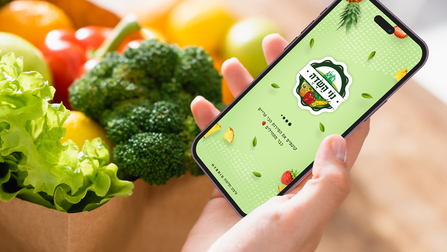
I led the creation of the Noy Hasade platform, aligning product and engineering to digitize traditional agriculture. Using customer insights, we prioritized ease of use, simplified the path to purchase, and introduced smart discovery to boost engagement. I collaborated with stakeholders to scale the platform, ensuring a seamless journey and driving customer retention.
Focus: Atomic-level components, UI/UX Design, Prototyping, Scalable, reusable system, Technical implementation
Results :
+125K Active Users | +12% Basket Size Lift | +3% Cashback Opt-in ↑
Goals
1.
Simplify the shopping journey by creating an intuitive flow that brings the farm-to-table experience to any devicez
2.
Increase trust by highlighting product freshness and providing clear information on the origins of the produce.
3.
Enhance user convenience by optimizing the checkout and delivery tracking process for a faster, frictionless experience.
4.
Drive customer loyalty by improving engagement through personalized recommendations and a seamless reordering system.
Business Goal
Traditional agricultural shopping lacked a modern digital experience, leading to high drop-off rates for users seeking a quick "farm-to-table" solution.
The existing purchase flow was fragmented across devices, making it difficult for customers to easily browse fresh produce and complete orders, which limited overall market reach.
Business need: Create a high-performance e-commerce platform that simplifies the shopping journey, increases user trust in product freshness, and scales the brand’s digital presence.
User problem
Customers wanting fresh, local produce struggled with a fragmented shopping experience, often having to choose between the quality of a physical market and the speed of generic delivery apps.
Existing digital options lacked transparency regarding product origin and freshness, while complex interfaces made it difficult to manage variable-weight items (like fruits and vegetables) on mobile devices.
User need: A dedicated, intuitive mobile experience that guarantees product quality, simplifies the selection of fresh produce, and offers a fast, reliable checkout process.
Ordering fresh produce online is often a high-friction experience due to complex interfaces and a lack of transparency, leading to user hesitation and abandoned carts.
Problem to solve
Competitive analysis
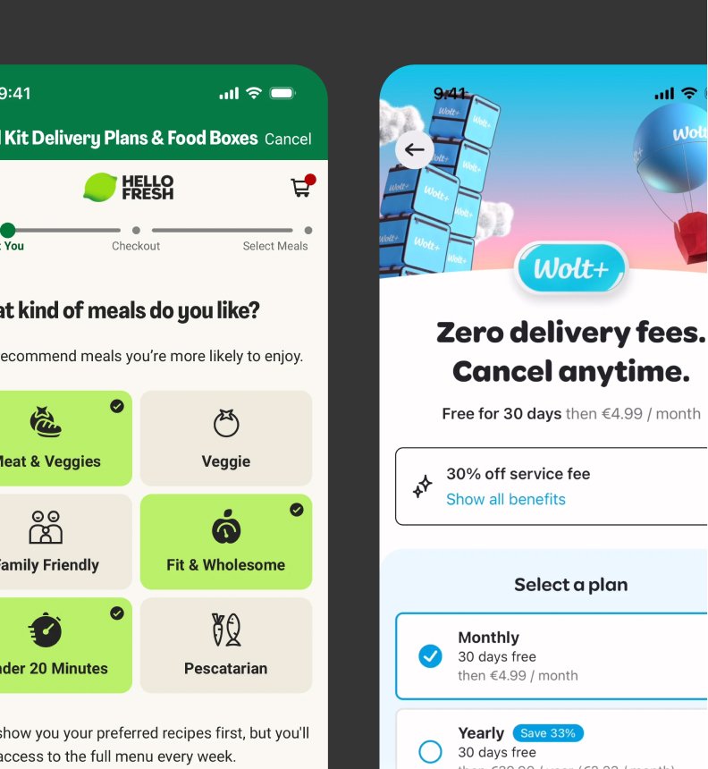
I studied local and international e-commerce platforms to identify best practices for checkout efficiency, trust-building, and cross-device navigation.
1.
Friction
High drop-off rates due to complex checkout flows and difficulty managing variable-weight produce on mobile devices.
2.
Trust
Users are hesitant to purchase fresh items online when product origins and quality guarantees are not clearly communicated.
3.
Navigation
Key product categories are often buried, making it difficult for users to quickly find seasonal items or complete recurring orders.
Friction
Accessible, low-friction entry points and streamlined checkout flows improve conversion.
Wolt: Uses a highly reactive interface and "one-tap" additions to minimize decision fatigue.
Trust
Clear communication of product quality and origin validates the user’s choice.
HelloFresh: Provides transparent ingredient sourcing and freshness guarantees to build user confidence.
Navigation
Predictive search and smart categorization reduce the time-to-purchase.
Instacart: Displays personalized "frequently bought" lists for instant reordering.
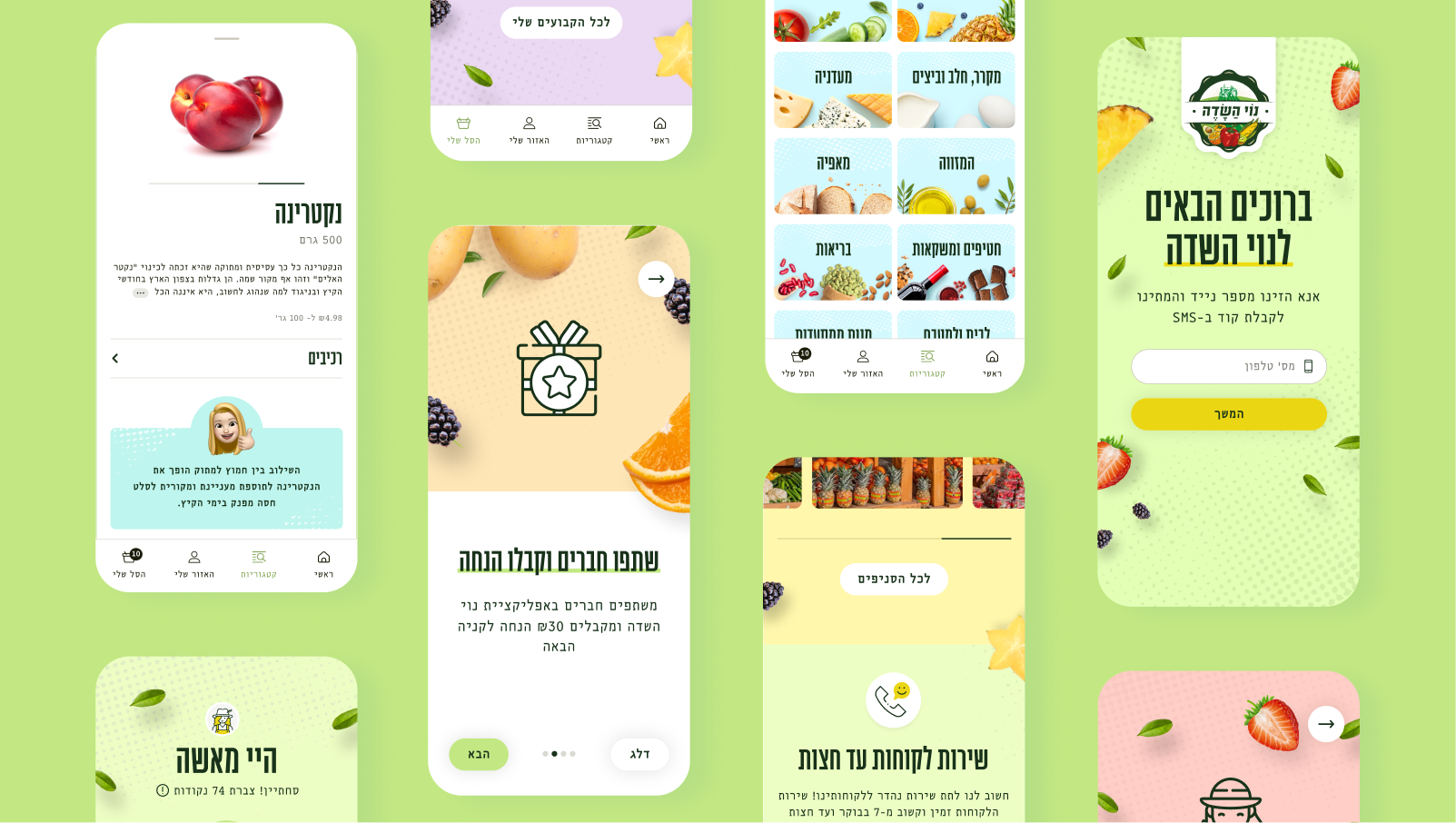
Mapping the purchase journey
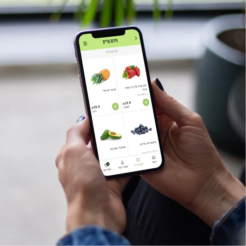
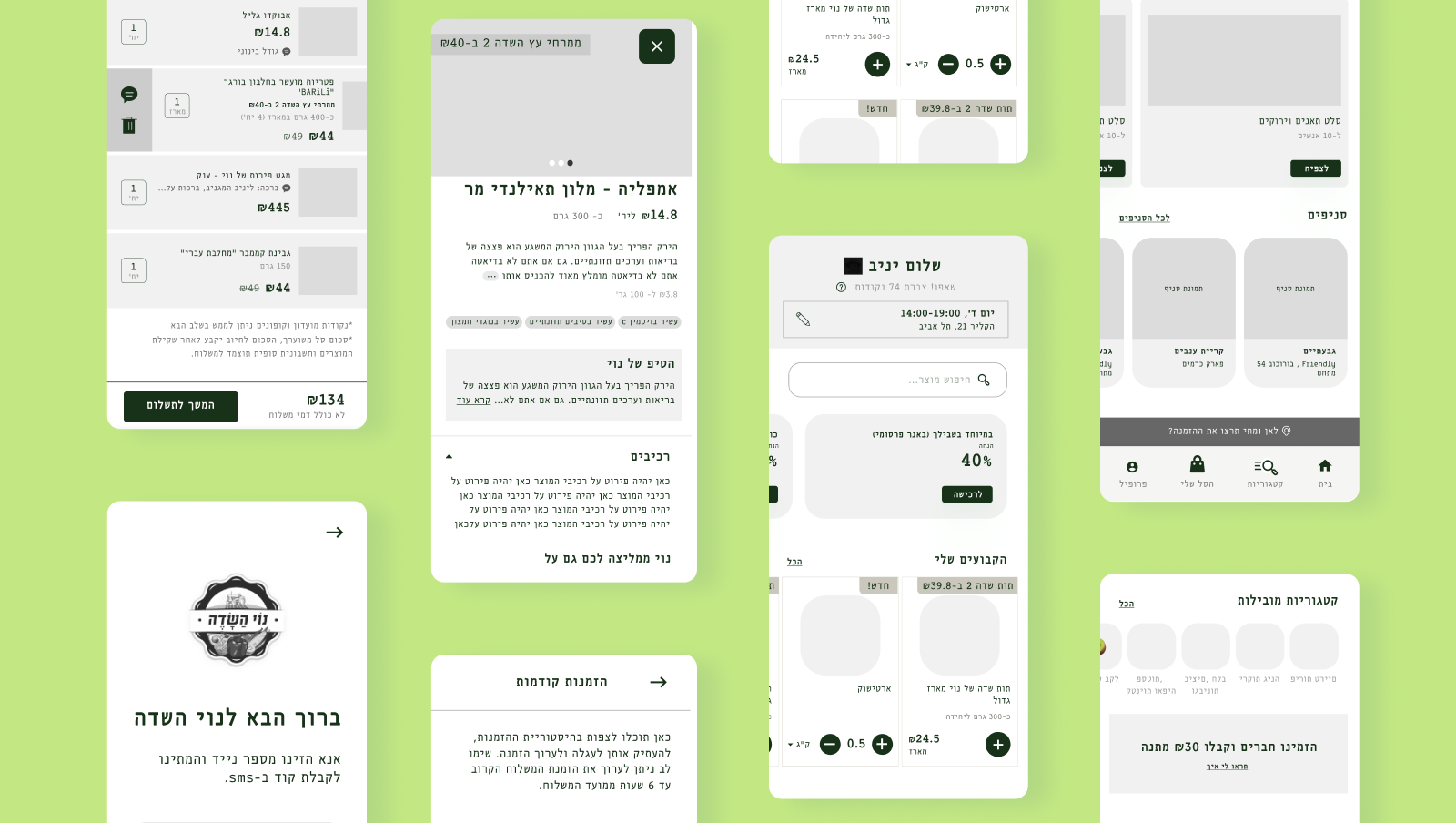
Guided by research insights, I iterated on design directions to align with user needs and business goals. Principles like transparency, efficiency, and freshness informed every aspect of the Noy Hasade experience. Smart Home Page: A dynamic feed highlighting seasonal picks and personalized recommendations to spark discovery.
Intuitive Lists: Centralize favorites and recurring items to allow for instant reordering in just a few taps.
Visual Product Pages: Deep transparency with clear origin labels and fresh-harvest indicators to build consumer trust.
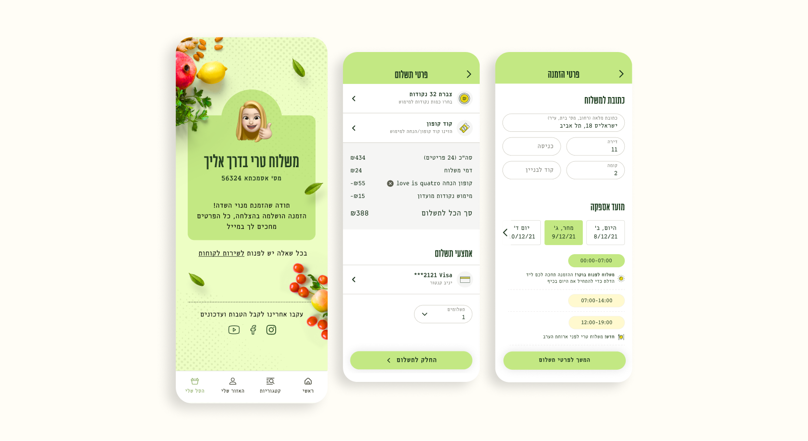
Optimized Checkout: A high-conversion payment flow that handles variable weights and delivery slots with zero friction.
Order Management: A dedicated space to track delivery in real-time and access history for effortless repurchasing.
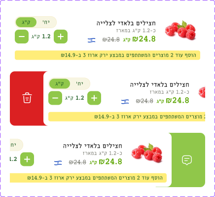
User testing
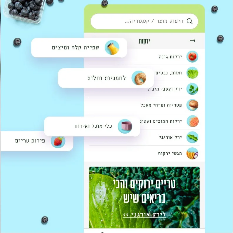
We tested two layouts for the category pages to identify which structure best reduced cognitive load and improved product discoverability:
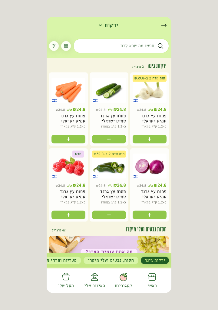
This layout prioritized a prominent search bar at the top, assuming users have a high intent to find a specific item. Sub-categories were placed at the bottom to keep the initial view focused on the search results.
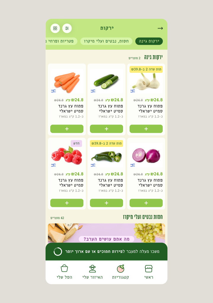
This layout prioritized horizontal sub-category chips at the top, allowing users to browse through related produce quickly without typing. The search was reduced to an icon to give more vertical space to the product grid and discovery filters.
A clear preference emerge
The new version replaces the bulky search bar with quick-tap sub-category chips, allowing users to browse "aisles" instantly instead of typing. This browsing-first approach reduces cognitive load, highlights more fresh product imagery to build trust, and streamlines the mobile experience for faster, seasonal discovery.
The proposed design
I designed a vibrant, playful interface that brings the energy of a real marketplace straight to the screen. By blending rich brand colors, fun micro-interactions, and sharp visual hierarchy, the app makes it easy to browse seasonal categories, handle variable weights, and breeze through a completely frictionless checkout.

The result
By focusing on reducing checkout friction and making product discovery a breeze, the new Noy Hasade experience successfully bridged the gap between agriculture and digital commerce. Moving away from third-party reliance gave the brand full control over its customer journey, leading to a massive boost in retention and smoother daily operations.
Results:+125K Active Users | +12% Basket Size Lift | +3% Cashback Opt-in ↑