Hot TV
I led the UX/UI design of the HOT TV Smart TV application, reinventing the living room entertainment experience for millions of viewers. Designed specifically for a 10-foot user interface, the application optimizes lean-back discoverability, fluid d-pad navigation, and visual hierarchy. By restructuring the on-screen architecture, the interface seamlessly unifies live television feeds, expansive VOD catalogs, and personalized streaming zones directly on the big screen.
Focus: Smart TV Interfaces, UI/UX Design, Prototyping, Scalable, reusable system, Information Hierarchy
Results : +1M Active Viewers | +25% VOD Completion Rate | 4.5 Hrs Avg. Daily Watch Time
Goals
1.
Simplify the viewing journey by creating an intuitive flow that brings a responsive, content-first television experience directly to the big screen.
3.
Enhance user convenience by optimizing layout frameworks and streamlining the switch between live broadcasting and VOD for a faster, frictionless experience.
2.
Increase trust by highlighting personalized recommendations and providing structured, clear channel metadata across the interface.
4.
Drive customer engagement by improving discoverability through progressive disclosure layouts and strategic on-screen menu touchpoints.
Business Problem
Traditional television interfaces are often slow, cluttered, and frustrating to navigate with a standard remote control. When viewers are stuck clicking through endless text-heavy menus or waiting for grids to load just to find a show, they tune out.
This friction limits on-screen VOD discovery and drops premium content consumption, directly impacting subscription upgrades and ad revenues.
Business need: Create a highly visual, fast-loading Smart TV ecosystem that captures immediate user attention, reduces time-to-play, and keeps viewers engaged within the platform's core channels.
User problem
Navigating a TV interface from across the room using only a remote control's arrow keys is historically tedious. Users face intense eye strain from small fonts, confusing layout grids, and hidden menu structures that make simply changing a channel or finding a movie feel like work.
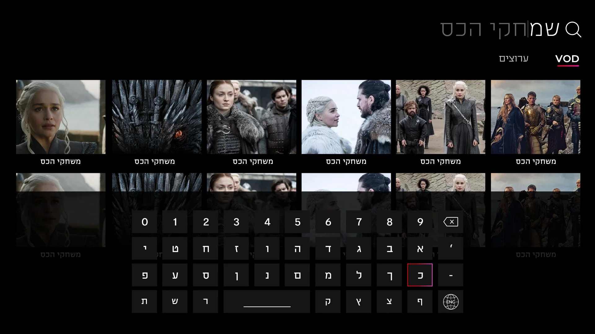
User need: A beautiful, responsive 10-foot interface with large visual cards, predictable directional tracking, and a clear grid layout that can be scanned effortlessly from the couch.
Competitive analysis
Friction
Smart TV apps suffer from massive user fatigue when layouts require excessive remote clicks or confusing vertical-to-horizontal navigation jumps to play content.
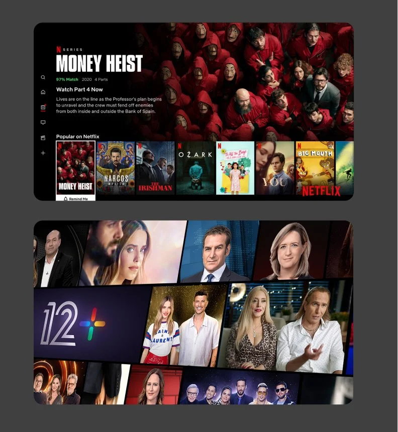
Netflix: Uses inline video auto-plays and instant trailer previews directly on the home dashboard to minimize decision fatigue and reduce the time-to-play.
Trust
Viewers get frustrated when on-screen channel details, video quality indicators, or subscription access requirements are confusing or hidden.
YouTube: Provides highly transparent live view counts, distinct duration tags, and clear channel verification badges directly on the content cards to build immediate user confidence.
Navigation
Crucial layout categories—like live TV guides, search, and personal watchlists—are often buried, forcing users to click backward through multiple screens to reset their journey.
Keshet 12: Features a prominent, instant-access "Live TV" banner directly at the top of the interface, allowing users to switch from on-demand browsing to broadcasting with a single remote click.
Mapping the purchase journey
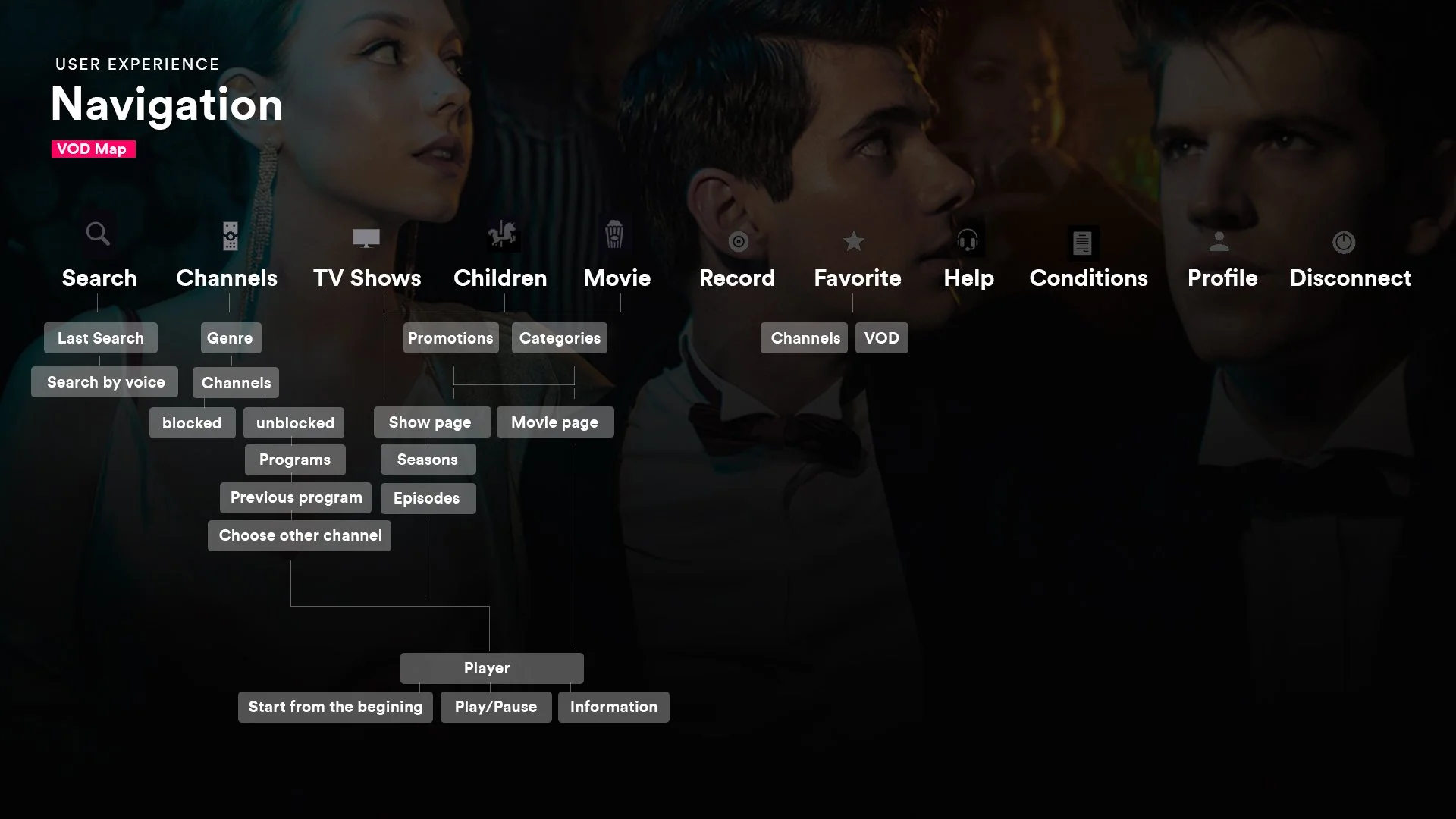
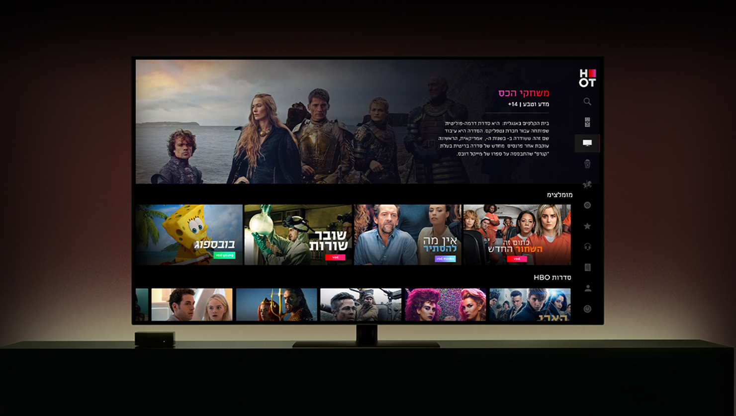
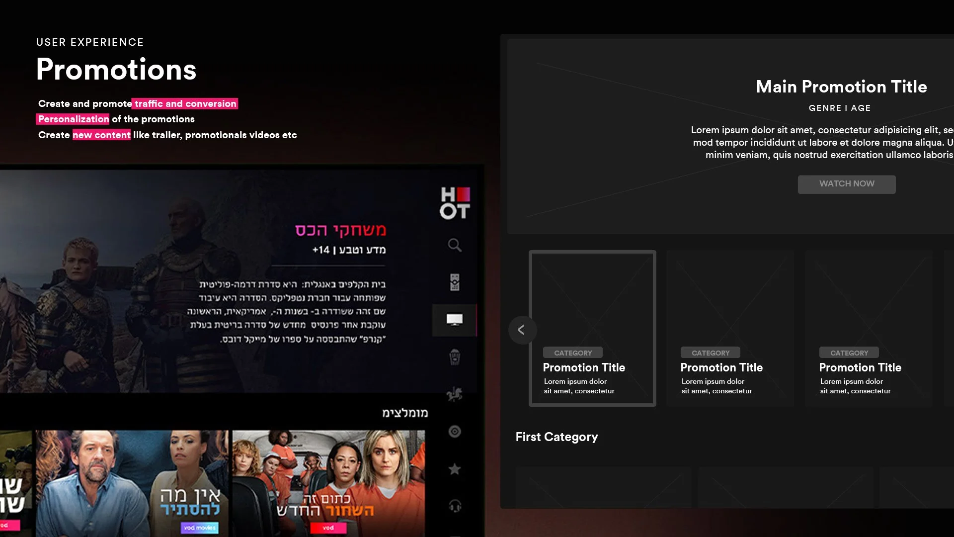
Smart TV Home Feed: A immersive, content-first dashboard featuring dynamic background imagery and curated video hero carousels to spark instant viewer interest.
High-Contrast Focus States: A highly clear visual feedback system using card scaling, outer glow borders, and distinct drop shadows so users always know exactly where the remote cursor is.
Visual Guide & Grid System: Clean, widescreen aspect-ratio content cards displaying high-impact posters and metadata snippets for effortless reading from a distance.
Optimized Player UI: A minimal on-screen overlay control framework that surfaces time-seeking bars, language toggles, and episode selectors with zero distraction from the video background.
The proposed design
My goal was to design a beautiful, effortless television interface that simply feels good to use with a remote control. I focused on making the browsing experience smooth and highly visual, replacing messy menus with a clean horizontal grid that lets users glide between live TV and video-on-demand. As you move across the screen, the background updates instantly with rich, cinematic imagery to pull you into the show before you even hit play. To make navigation feel completely natural from the couch, I designed high-contrast focus states that clearly highlight the selected card, alongside a minimal, low-opacity player overlay that handles settings without blocking the screen.
The result
The redesign completely transformed how millions of households interact with HOT TV, making content discovery feel effortless. By moving to the new visual grid and clear focus states, we drastically cut down the time users spent clicking around to find something to watch.
Results : +1M Active Viewers | +25% VOD Completion Rate | 4.5 Hrs Avg. Daily Watch Time