Herzliya Medical Center
I led the UX/UI design of Herzliya Medical Center’s digital ecosystem, bridging the gap between complex clinical data and empathetic user experiences. By designing intuitive mobile applications for patients, medical staff, and corporate partners, we transformed stressful healthcare journeys into seamless, transparent interactions. I focused on creating clean visual timelines, effortless tracking tools, and highly accessible interfaces that simplify hospital processes, reduce user anxiety, and establish a deeply supportive care journey from any device.
Focus: Atomic-level components, UI/UX Design, Prototyping, Scalable, reusable system, Technical implementation
Results :
85% Anxiety Reduction | 4.5/5 Patient Satisfaction | -20Pre-op No-shows
Goals
1.
Simplify the medical journey by creating a clear, calm digital experience that gently guides patients through complex pre-surgery steps.
3.
Enhance staff convenience by optimizing work platforms, making shift tracking and time-logging completely friction-free for busy doctors and nurses.
2.
Increase trust by providing transparent, easy-to-understand medical timelines and instant access to clear care requirements.
4.
Drive health engagement by creating a highly rewarding ecosystem that encourages corporate partners book preventative wellness screenings.
Business Goal
Preparing for surgery is historically stressful, and a lack of clear digital guidance can lead to high patient anxiety and missed pre-operative requirements. When patients are confused about fasting times, medication adjustments, or arrival schedules, it leads to a surge in repetitive hospital support calls and preventable procedure delays.
The existing preparation process relied heavily on fragmented paperwork and manual phone calls, making it difficult for patients to track their specific medical timelines and easily verify completed tasks. This operational friction strained hospital administration and limited overall care efficiency.
Business need: Create an empathetic, high-performance patient application that simplifies the pre-surgery journey, increases user trust through transparent medical timelines, and scales the hospital's digital care delivery.
User problem

Patients preparing for an upcoming surgery face immense stress and a fragmented pre-operative experience, often struggling to balance overwhelming hospital instructions with the fear of the procedure itself.
Existing digital communication options lack clear, centralized guidance, making it incredibly difficult for individuals to track critical timelines—like exact fasting cutoffs or required medication adjustments—on their mobile devices, leaving them feeling anxious and unsupported.
User need: A calm, intuitive mobile experience that breaks down complex pre-surgery instructions into a transparent timeline, simplifies preparation tracking, and offers an easy, reassuring way to arrive at the hospital ready and confident.
Problem to solve
Preparing for a major medical procedure is often a high-friction experience due to confusing clinical paperwork and a lack of transparent timelines, leading to intense patient anxiety and preventable hospital schedule delays.
Competitive analysis
I studied local and international e-commerce platforms to identify best practices for checkout efficiency, trust-building, and cross-device navigation.
1.
Friction
High drop-off rates due to overwhelming, clinical onboarding screens and a lack of visual confirmation when completing required pre-operative tasks on mobile devices.
2.
Trust
Patients feel anxious and hesitant when critical surgical preparation guidelines, like fasting milestones or medication adjustments, are not clearly or transparently communicated.
3.
Navigation
Essential care instructions and hospital arrival details are often deeply buried, making it difficult for users to quickly find time-sensitive checklists or contact immediate medical support.
Friction
Accessible, low-friction onboarding and streamlined selection flows improve user confidence.
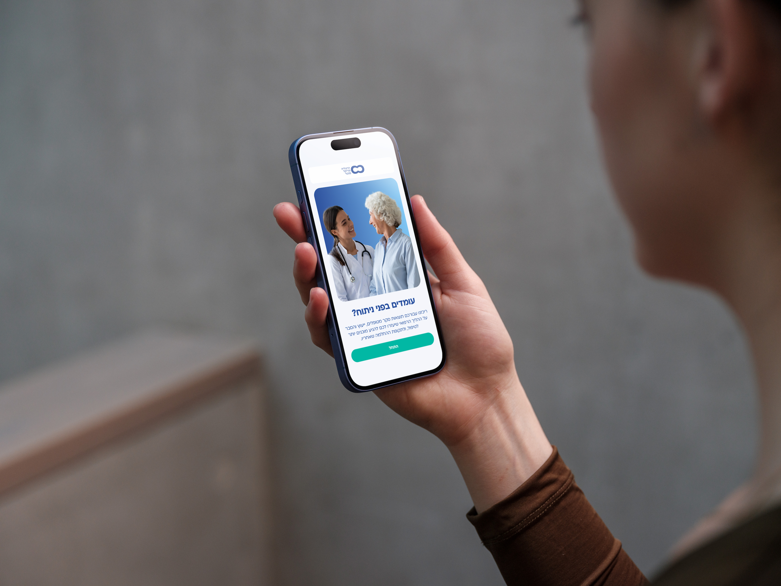
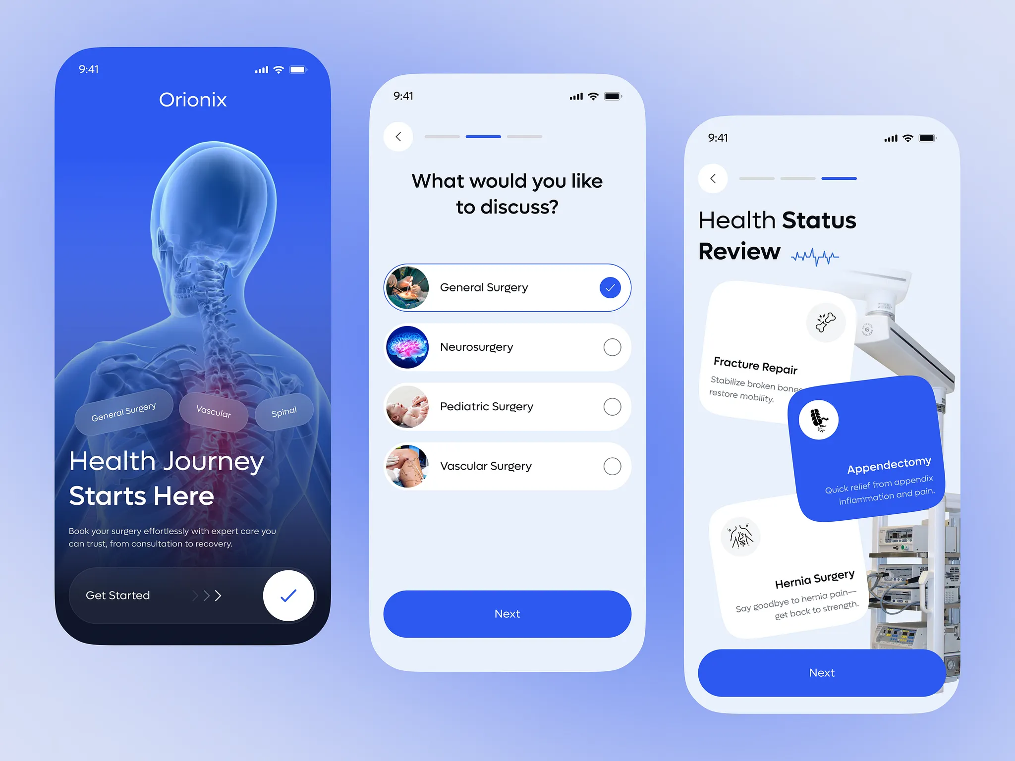
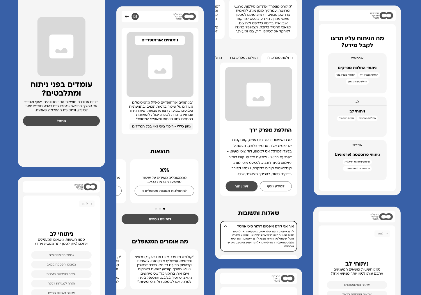
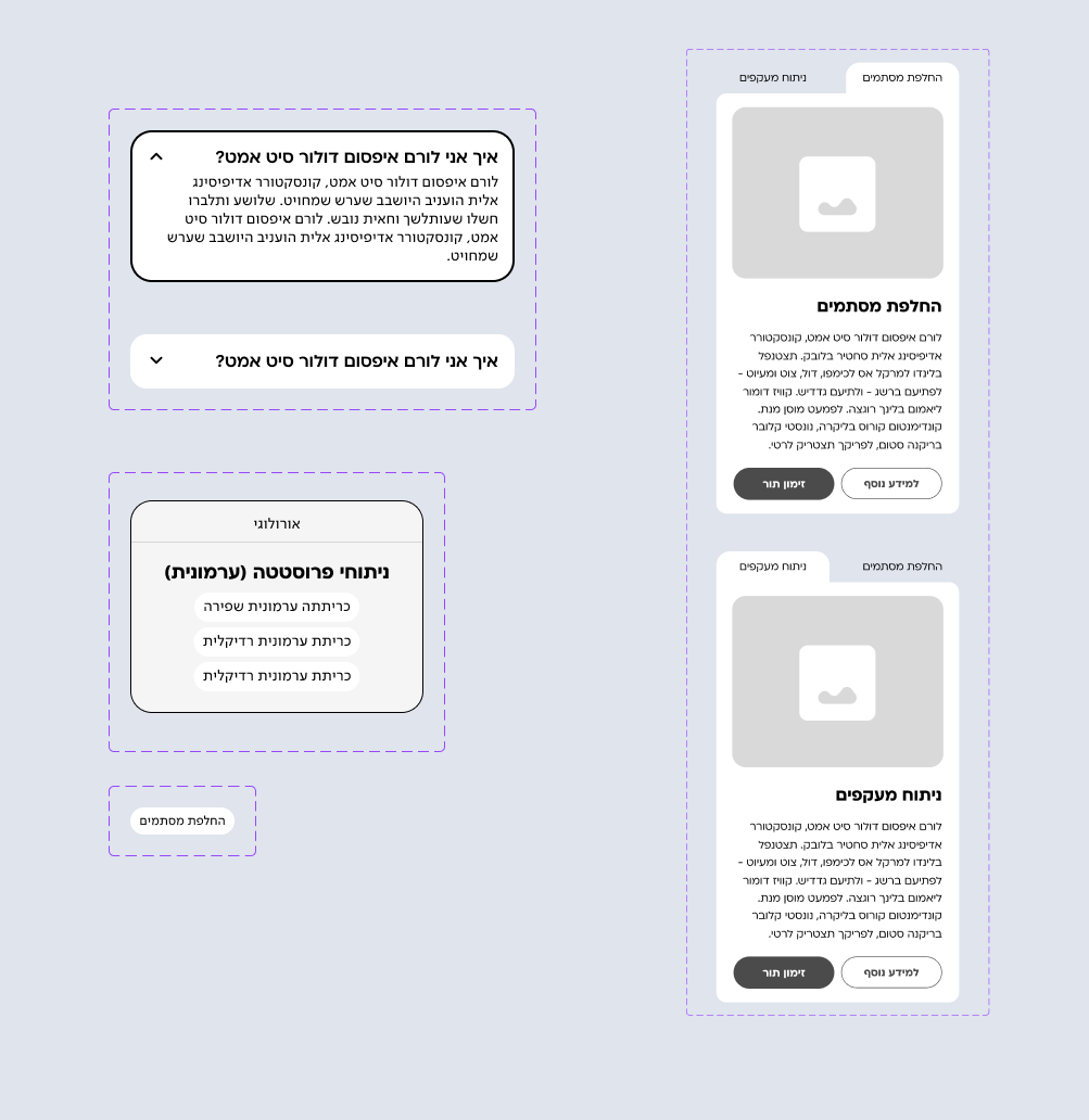
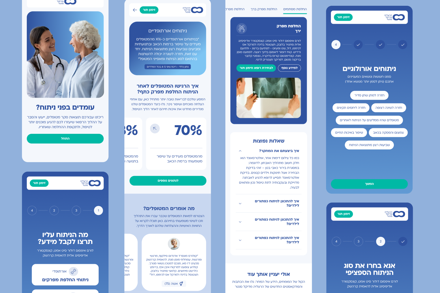
The Solution: We replaced dense clinical forms with a highly visual, step-by-step questionnaire. Using interactive anatomical markers and clear single-tap choice cards minimises decision fatigue during a stressful time.
Trust
Clear communication of medical pathways and procedural steps validates the user's choice.
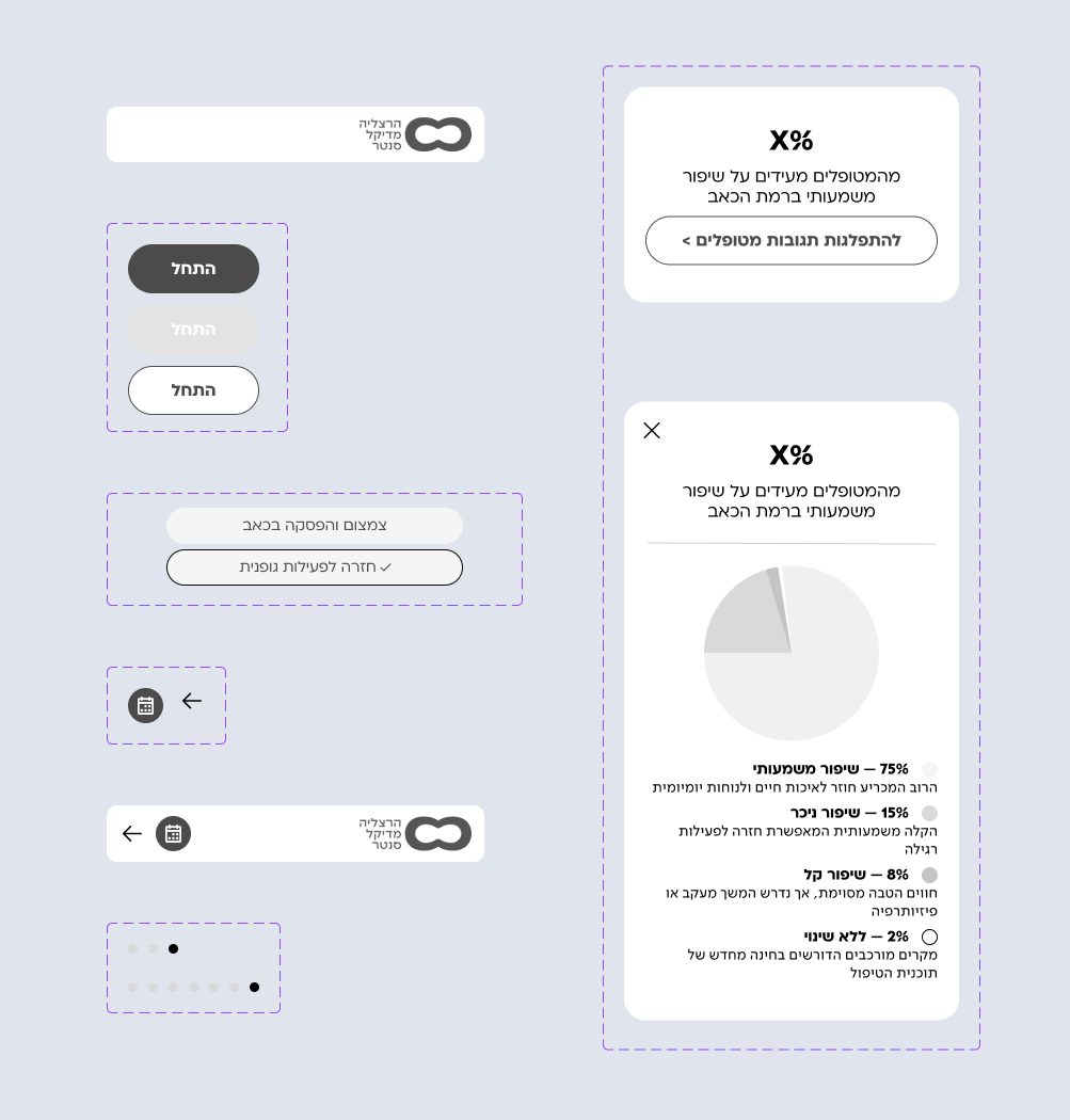
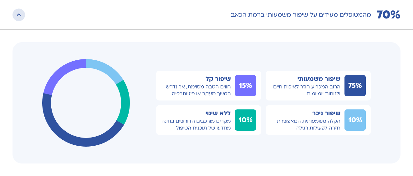
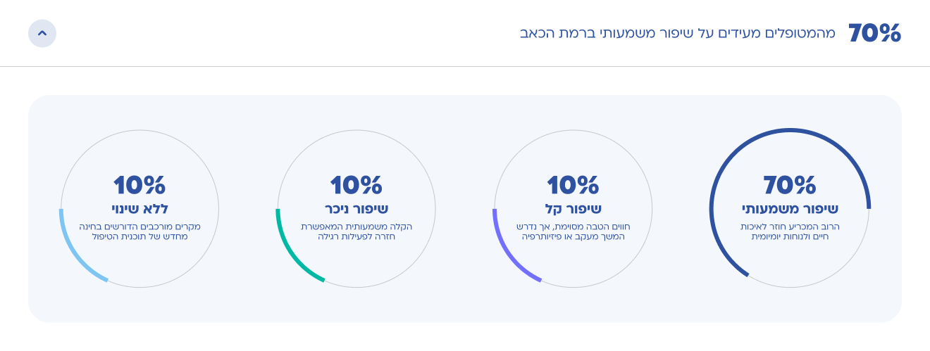
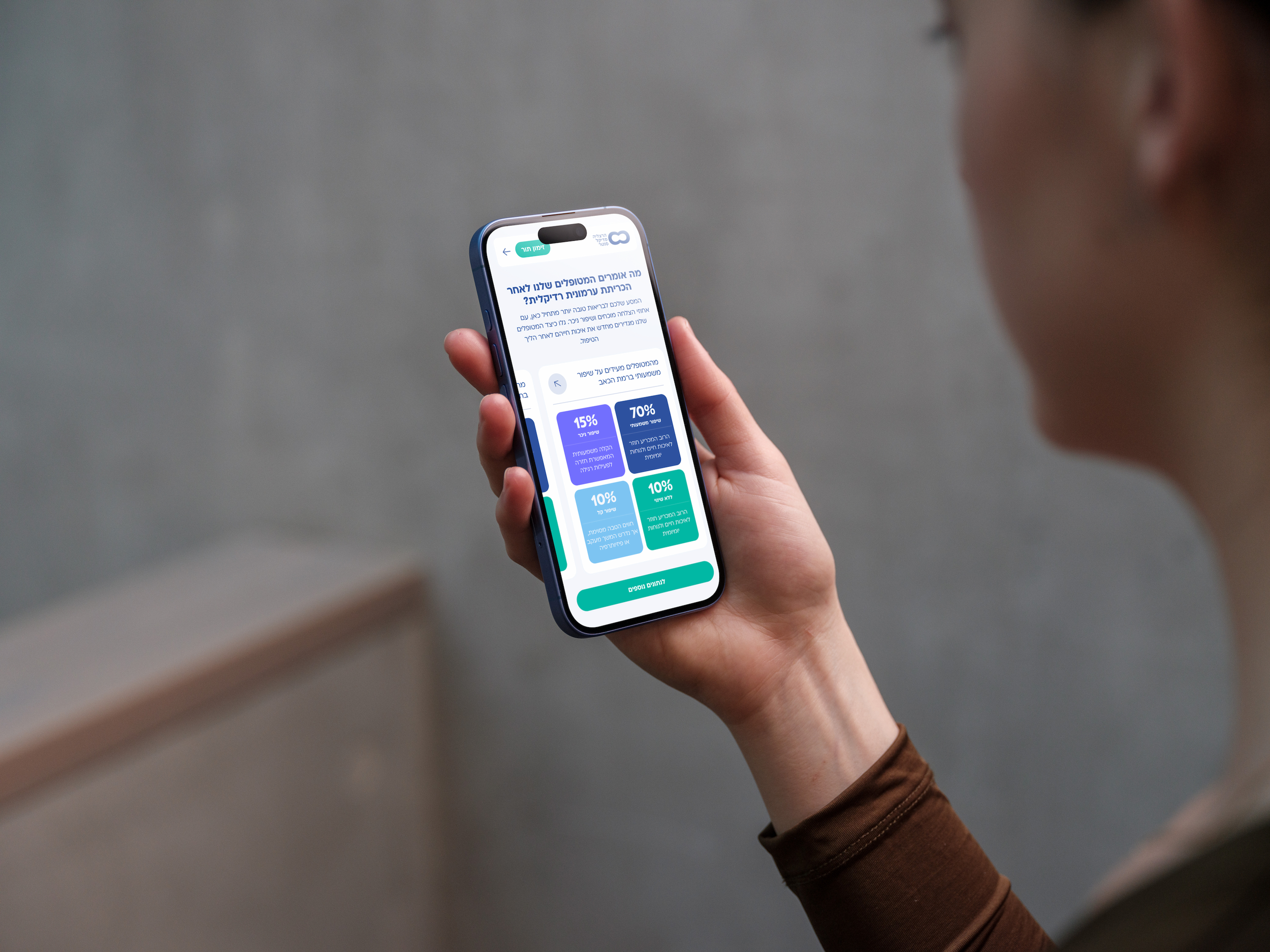
The Solution: We designed a validation state that shows concrete statistics, like checklist completion percentages and exact arrival countdowns at the end of the process. Displaying these tangible metrics replaces clinical ambiguity with a trustworthy green light, giving patients absolute confidence that they are 100% prepared and compliant before stepping into the hospital.
Navigation
Predictive choices and smart categorization drastically reduce the time-to-readiness.
The Solution: We structured the core layout around a fluid, linear progression. By highlighting key procedure cards, like fracture repairs or appendectomies, directly on the active review feed, patients can track their status and complete critical pre-surgery milestones without digging through complex menus.
Mapping the journey
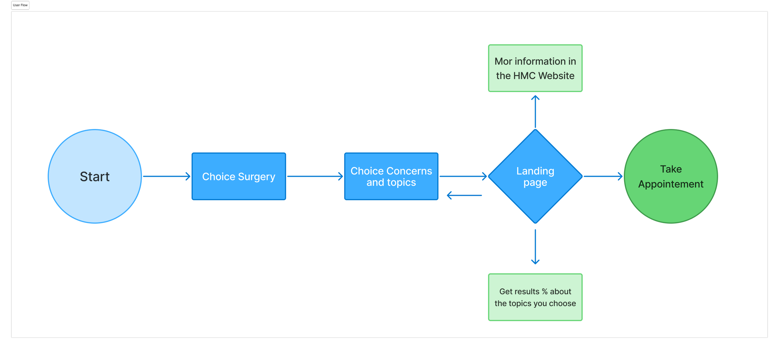
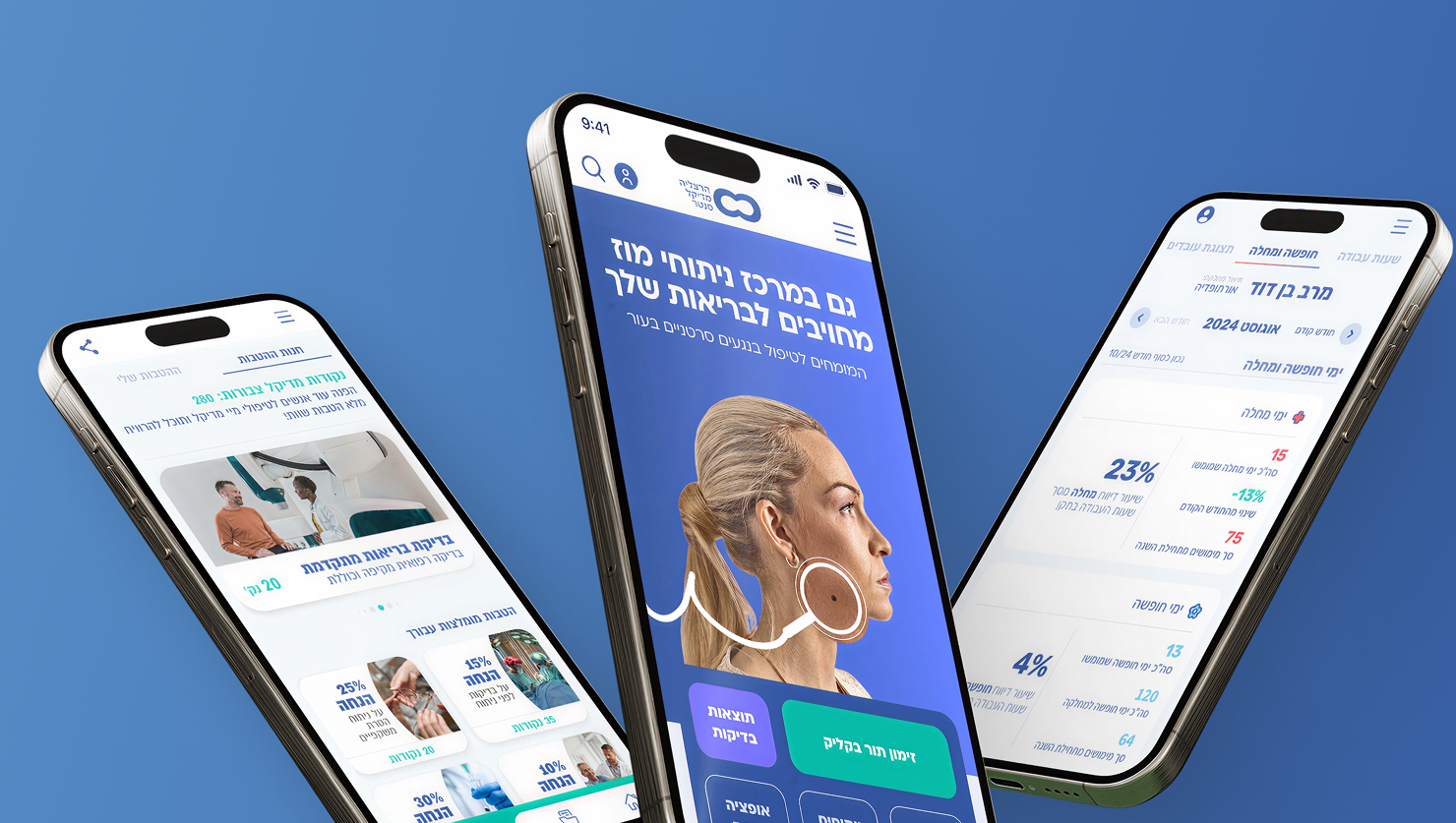
Guided by research insights, I iterated on design directions to align with patient needs and clinical goals. Principles like clarity, transparency, and reassurance informed every aspect of the HMC onboarding experience. Smart Home Page: A dynamic, calming feed highlighting immediate timeline milestones and personalized pre-operative instructions to eliminate guesswork.
User testing
We tested two layouts for the patient dashboard to identify which structure best reduced cognitive load, minimized anxiety, and improved the discoverability of time-sensitive pre-operative instructions:
This layout prioritized a single, unified data visualization chart on the left, paired with a clean grid breakdown of specific status topics on the right. We assumed a centralized summary would allow patients to quickly gauge their overall medical readiness in one glance, keeping the main view compact, calm, and highly structured.
This layout prioritized a horizontal, linear progression of individual metric rings across the screen. By breaking down the data into separate chronological chunks, it allowed users to browse through their specific preparation stages sequentially.
A clear preference emerge
The winning version structures patient readiness into a chronological, step-by-step layout rather than forcing them to digest all their clinical data at once. This progressive-disclosure approach significantly reduces cognitive load during a stressful period, utilizes clear metric summaries to instantly build user trust, and streamlines the mobile interface for a faster, reassuring confirmation experience before hospital arrival.
The proposed design
I designed a vibrant, playful interface that brings the energy of a real marketplace straight to the screen. By blending rich brand colors, fun micro-interactions, and sharp visual hierarchy, the app makes it easy to browse seasonal categories, handle variable weights, and breeze through a completely frictionless checkout.

The result
By focusing on reducing onboarding friction and making critical guidelines a breeze to track, the new HMC patient experience successfully bridged the gap between complex medical requirements and supportive digital care. Moving away from fragmented manual paperwork gave the hospital full control over its digital patient readiness journey, leading to a massive boost in clinical preparation compliance and smoother daily operating room workflows.
85% Anxiety Reduction | 4.5/5 Patient Satisfaction | -20Pre-op No-shows